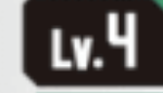
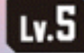
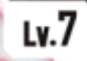
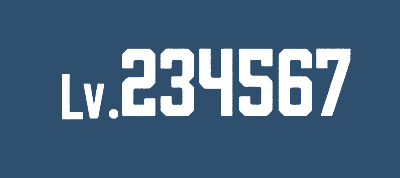
Level
current confidence: high, all glyphs match
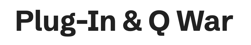
Name
current confidence: high; all glyphs match

j.griin found Falling Sky which has a nice capital I and capital Q while still being close on the general shape of the "g". however, the but the serif on the top of the "g" is going the wrong direction and the serif on the bottom right of the "a" is also incorrect.
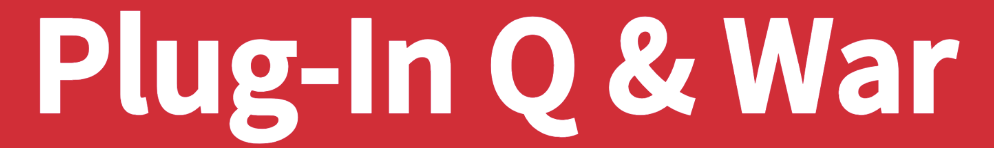
however, the most distinctive glyph is the ampersand
this solves the mystery, we have Toppan Bunkya Gothic. weird how it's a merge of two others.
Cost
current confidence: medium to high
01234567890
However, HelveticaNeue is better, and also used in DP.
For the "level" field of the circle, Roboto seems decent match, tough to say
For the evo cost, . Look at "0" again. the actual "0" looks more rounded. like helvetica. it's weird for them to be so close yet different so i really want to say they're both Ayar Kasone.
neue 1, short name
neue 2, full name
neue 3a, HN, bold normal 1234567890
neue 3b, HN, normal normal 1234567890 bold 1234567890
neue bq 1234567890 bold 1234567890
neue bqc 1234567890 bold 1234567890
neue lt, lt pro
neue lt Bold, lt pro
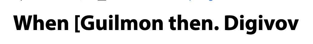
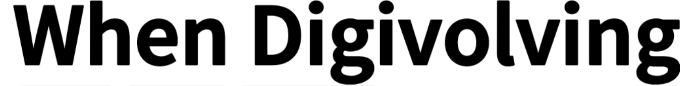
Effect Text
current confidence: high outside keyword, medium inside keyword
The effect text outside has straight lower-case L and the lower-case G has a hook. Inside of a colored-block, the l is curved and the g is hooked. the "t" has a sloped top, but the "h" does not even though it looks like it does in this picture. i think AI "improved" this picture as I took it but check the physical card, there's no slope on "h"
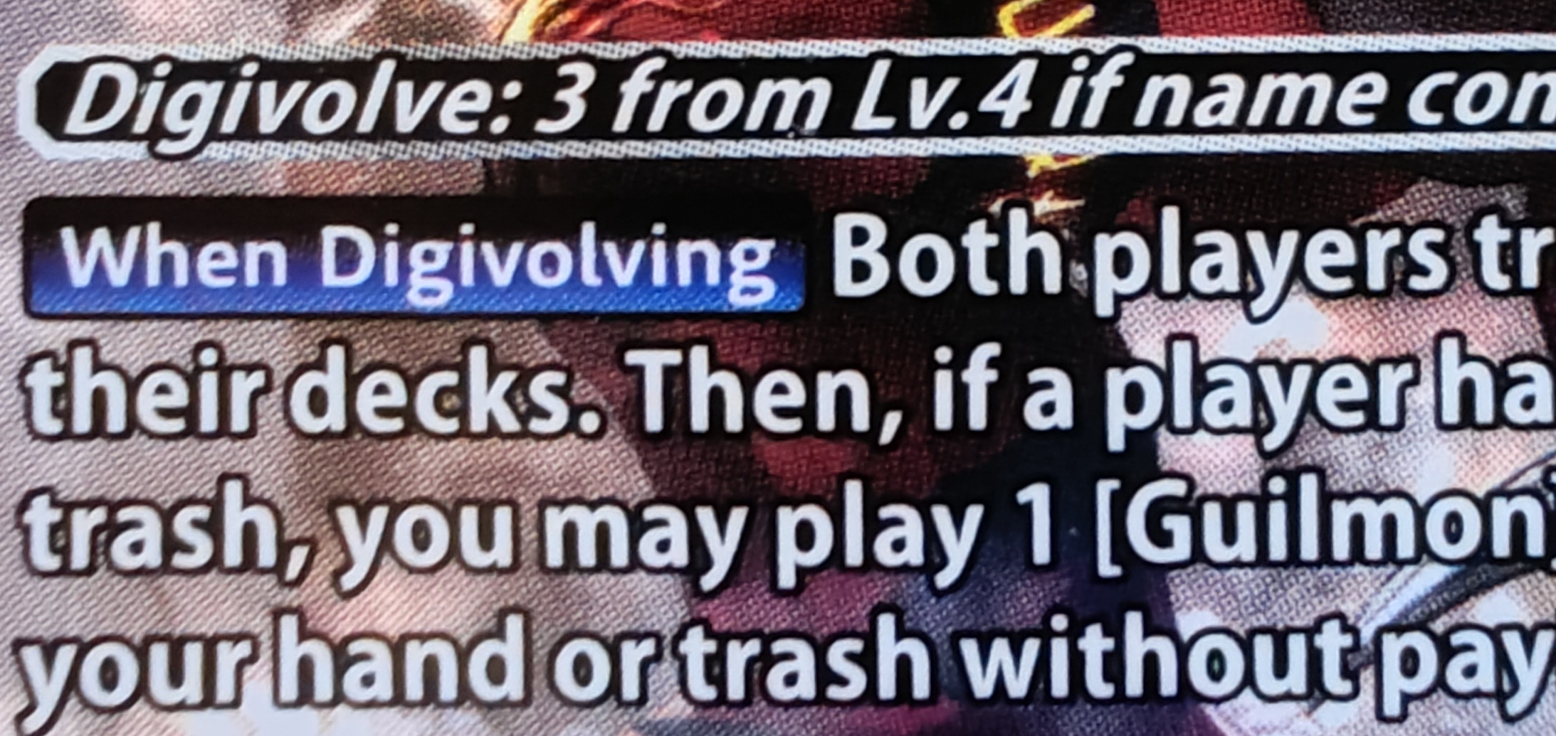
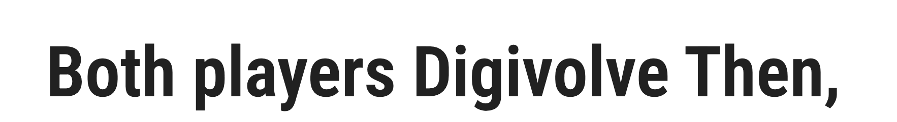
i can match a complete row of text down to the pixel. this is definitely right.


...
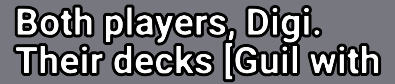
Traits
current confidence: medium-high

Repo Medium sort of matches, except that the lower-case U and lower-case G are missing prongs.

Myriad, again, may be the right answer, but it needs to be "squashed" like the keyword text, but note that they're definitely not the same font there, as the "g" has a hook here.